Web Development
 APP Development
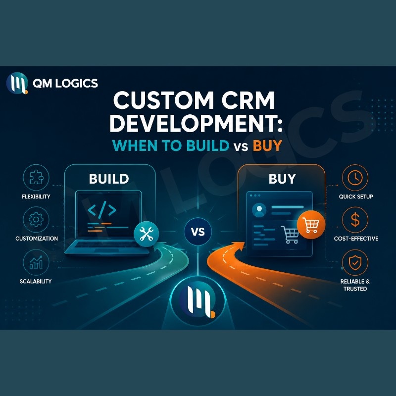
 CRM Development
 Generative AI
 QA Testing & Automation
People ask this all the time. “Does design actually affect my revenue?” And I get why they ask. Design feels like an expense, not an investment. But here is what the data actually says: users form an opinion about your website in under 50 milliseconds. That is not a typo. Half a second, and they have already decided whether to trust you or leave.
So yes, design affects your revenue. A lot.
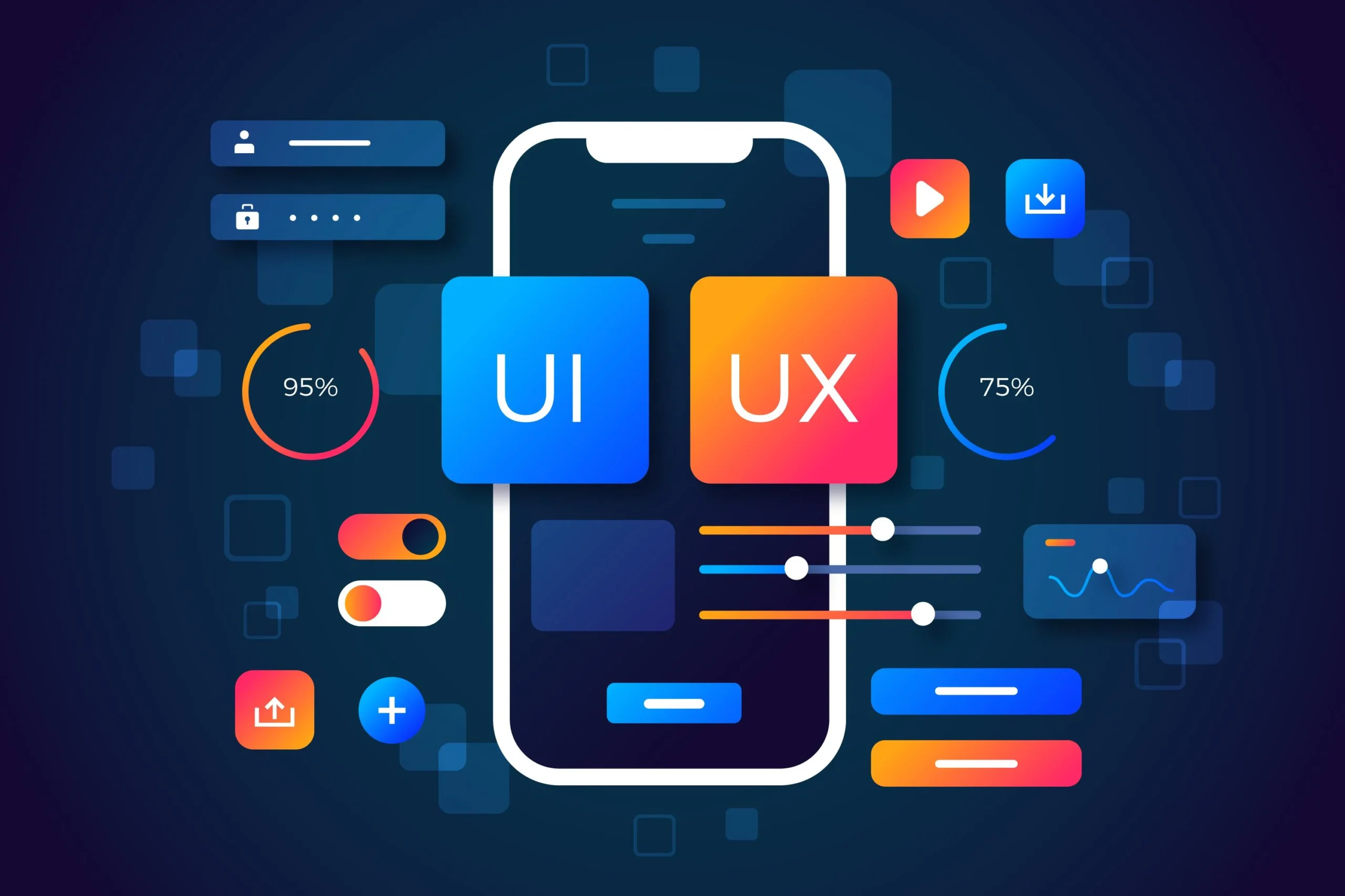
The term UI stands for User Interface, basically, how your site looks. UX stands for User Experience, how it feels to actually use it. When both work together, your website becomes a sales machine. When they do not, it becomes a very expensive digital brochure that nobody reads.
UI/UX Design and Development Services That Make a Strong First Impression
Here is the reality nobody tells you upfront.
Before your visitor reads your headline, before they see your pricing, before they even scroll, they have already judged your entire business. Research confirms that 94% of first impressions online are design-based. Not product-based. Not price-based. Design.

Amazon is the cleanest example of this. Their homepage is not beautiful in the traditional sense. It is not winning any design awards. But it is incredibly clear. You land on it, and you immediately know what to do. That clarity is the entire point of good UI/UX design.
Here is what makes or breaks a first impression:
| Element | Why It Matters |
| Clean layout | Users find what they need without thinking |
| Page load speed | Every extra second costs you visitors |
| Clear headline | Tells users instantly what you offer |
| Mobile design | Over 60% of traffic is on phones |
| Trust signals | Reviews, certifications, and real faces |
“Design is not just what it looks like. Design is how it works.” — Steve Jobs
If your above-the-fold section does not immediately communicate your value, the rest of your page does not matter. Most visitors never scroll that far anyway.
UX/UI Design Services That Keep Users on Your Website Longer
Think of your website like a physical store.
If someone walks in and cannot find what they are looking for in the first few seconds, they walk out. No one stops them. No one apologizes. They just leave. Your website works the same way, except there are no staff to help, so the navigation has to do all the work.
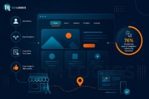
76% of users say ease of navigation is the most important thing they look for on a website. Not the color scheme. Not the animations. Navigation.
What Good Navigation Looks Like
Good navigation looks like this:
- A top menu with 5 to 6 clear options, nothing more
- A visible search bar if your site has a lot of content
- Internal links that naturally guide users to the next step
- Breadcrumbs on deeper pages so users always know where they are
Backlinko does this really well. Every article connects to another. You start reading one piece, and before you know it, you have clicked three internal links and spent 20 minutes on the site. That is not accidental. That is intentional UX design.
The goal is to remove any moment where a user has to think too hard. Every moment of confusion is a potential exit.
UI and UX Services That Actually Drive Conversions and Sales
Let me give you a number that will change how you think about design budgets.
A well-designed user interface can increase your conversion rate by up to 200%. Better UX can push that to 400%. That is from Forrester Research, not a design agency trying to sell you something.

Airbnb is probably the best real-world example of this. They were not getting enough bookings. They did not run more ads. They did not lower their prices. They redesigned their listing pages with larger photos and a simplified booking flow. Bookings went up by 25% and the average time to booking dropped by 30%. That is what design does when it is done right.
UI/UX That Boosts Conversions
Here is where UI/UX directly moves the needle on conversions:
- A clear CTA button that stands out removes hesitation
- A short checkout process stops people from abandoning mid-purchase
- Fast load times keep users from bouncing before they even see your offer
- Trust signals placed near the buy button push people over the line
Walmart’s own data showed that every one-second improvement in load speed produced a 2% increase in conversions. If you are running paid traffic to a slow website, you are pouring money into a leaking bucket.
UI Design Services That Build Real Trust and Credibility
Nobody buys from a website they do not trust.
And trust is not built through words. It is built visually, before a single sentence is read. Research shows 75% of users decide whether a business is credible based on how the website looks. That is, 3/4 of people judge you by your design before they read anything you have written.
This is what trust looks like in design:
- Consistent fonts and colors across every page
- Real photos of your team instead of stock imagery
- Client testimonials with names, not just anonymous quotes
- Security badges visible near forms and checkout
- An updated blog or portfolio showing active, working knowledge
Banks and fintech companies nail this. Everything on their websites feels safe and organized. Nothing is cluttered. Nothing feels risky. That sense of safety is engineered through design, not copy.
If your business sells professional ui ux design services, your own website is your case study. If it does not look the part, no amount of case studies in your portfolio will fix that first impression.
Natural User Interface Design for a Better Mobile Experience
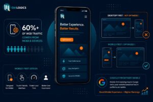
More than 60% of all web traffic comes from mobile devices right now.
If your website is designed for desktop and then crammed onto a phone screen, you are already losing the majority of your visitors. And Google knows this. Mobile-first indexing means Google ranks your website based on how it performs on mobile, not desktop. So a great desktop experience with a broken mobile version will quietly tank your search rankings.
A natural user interface on mobile means:
- Readable text without pinching or zooming
- Buttons big enough to tap without hitting the wrong thing
- Pages that load in under 3 seconds on a mobile connection
- A navigation menu that actually works on a small screen
- Forms with as few fields as possible
62% of businesses saw a direct increase in sales after they optimized for mobile responsiveness. That is not a design trend. That is a revenue decision.
If your mobile experience is frustrating right now (then contact), everything else you do in marketing is working against itself.
Intelligent User Interfaces That Reduce Your Bounce Rate
Your bounce rate is your website telling you something is wrong.
When visitors land on a page and leave without clicking anything else, it means one of three things. Your design is confusing. Your page is too slow. Or your content did not match what they expected to find. All three of those are fixable through UI/UX design.
Here is a breakdown of the most common bounce rate problems and what actually fixes them:
| Problem | Fix |
| Page takes more than 3 seconds to load | Compress images, clean up unnecessary scripts |
| Layout is cluttered or hard to scan | Use whitespace and clear visual hierarchy |
| Mobile experience is broken | Rebuild with mobile-first in mind |
| No clear next step for the user | Add visible, specific CTAs throughout the page |
| No trust signals on landing pages | Add reviews, real team photos, or certifications |
A SaaS company had a 42% bounce rate on its main landing pages. They were spending heavily on paid traffic. Almost half of it was walking straight back out. After reducing load time from 4.8 seconds to 1.9 seconds and fixing the mobile layout, bounce rate dropped and sign-ups went up by 15%. Nothing about the product changed.
Users do not stay because a website looks cool. They stay because it makes sense.
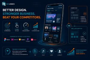
UI/UX Software and Tools That Help You Beat Your Competitors
In a market where every business has a website, the ones with better design win.
It is not about having more features or flashier animations. It is about being clearer and easier to use than whoever else is competing for the same customer. Spotify is a great example. Their app is so smooth that users never think about the interface. You tap, the music plays, the recommended playlist feels like it was made for you. That invisibility is the highest form of UX success. When design works perfectly, users do not notice it at all.
The things that separate average websites from great ones:
- A/B testing to find which layout version actually converts better
- Heatmaps to see where users click and where they stop scrolling
- Session recordings to watch real users struggle with real problems
- Core Web Vitals monitoring to protect your Google rankings
- Accessibility standards so your site works for every type of user
“Good design is invisible. Bad design is everywhere.” — Joe Sparano
Businesses that are outperforming their competitors online are not necessarily spending more on ads. They are spending more on experience. When your website is easier and more trustworthy to use than your competitor’s, users naturally choose you. That advantage compounds over time.
If your competitors have average UI/UX and you invest in getting it right, you own that gap. And that gap is where growth lives.
Conclusion
Your website is not just a digital presence. It is your best salesperson, working around the clock, talking to every potential customer before you ever get the chance to.
If the experience it delivers is confusing, slow, or visually untrustworthy, it is actively costing you business every single day. And most of the time, businesses do not even realize it because nobody tells them when they leave.
Good UI/UX design fixes that. It makes staying easier than leaving. It makes trusting easier than doubting. And it makes buying feel like the natural next step.
At QM Logics, that is exactly what we build. If your website is not converting the way it should, let us take a look and show you what is actually getting in the way.
Frequently Asked Questions
What is UI/UX design, and why does it matter for my business?
UI is the visual side of your website, the layout, buttons, fonts, and colors. UX is how it feels to actually use it. Together, they determine whether a visitor becomes a customer or leaves in frustration. A bad experience costs you sales. A good one builds loyalty.
How does UI/UX design affect my Google rankings?
Google measures user behavior signals like page speed, mobile responsiveness, bounce rate, and time on page. All of these are directly shaped by your design. A website that users enjoy using tends to rank higher because Google sees the engagement and treats it as a quality signal.
What is the difference between UI design and UX design?
UI is what people see. UX is what they feel. A beautiful homepage with a confusing checkout is great UI and poor UX. A plain-looking site that is effortless to navigate is the opposite. The best websites do both well, and you usually cannot tell where one ends and the other begins.
How quickly do users judge a website?
Research shows it takes around 50 milliseconds. That is before anyone has read a single word. The layout, the colors, the speed, and the first screen they see make the decision for them. This is why the design of your landing page matters more than almost any other element.
Will better UI/UX design actually increase my sales?
Yes, and the numbers back it up. A better user interface can increase conversions by up to 200%. Improved UX has been shown to push that figure to 400%. Airbnb redesigned their listing pages, and bookings went up 25%, with no change to pricing or advertising spend.