Web Development
 APP Development
 CRM Development
 Generative AI
 QA Testing & Automation
If you have ever landed on a website and clicked away within seconds, you already understand this better than any statistic can explain. People asking this same question want to know one thing: Is my website costing me, customers? The answer is almost yes, and the reason is almost always design.
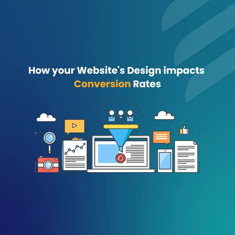
Website design is not just about looking good. It decides whether a visitor trusts you, stays on your page, and eventually converts. Whether you are working with a b2b website design agency, building a construction website design, or launching a medical website design, the rules of conversion-driven design apply to every industry.
First Impressions: Website Design and Trust in Under 3 Seconds
You do not get a second chance at a first impression. That is not just a saying; it is backed by data.
Research shows users form a snap evaluation of a website’s design within 50 milliseconds, and for 94% of users, that initial impression hinges entirely on design elements. That is faster than a blink. Convergine Corp.
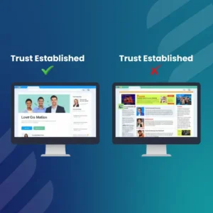
Stanford University research found that 75% of users judge an organization’s credibility based on its website design. DatAchieve Digital
Think about that. Before they read a single word of your content, 3/4 of visitors have already decided whether they trust you.
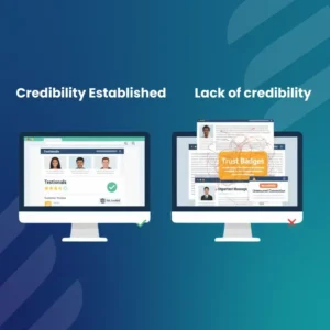
What kills trust instantly:
- Outdated or cluttered layouts
- Low-quality images or inconsistent branding
- No clear value proposition above the fold
- Missing contact information or trust signals (reviews, certifications, badges)
A real-life example: Amazon has tested and redesigned its product pages constantly over the years. Every element, from the placement of the buy button to the star ratings shown above the fold, is deliberately placed to build immediate trust and push toward a purchase decision.
For a manufacturing website design or a B2B website design, this matters even more because your buyer is a professional making a business decision. They need to feel confident before they even scroll down.
Visual Hierarchy and Attention Flow: Guide the Eye, Control the Click
Good UI design services are not about making things pretty. They are about controlling where the visitor looks and in what order.
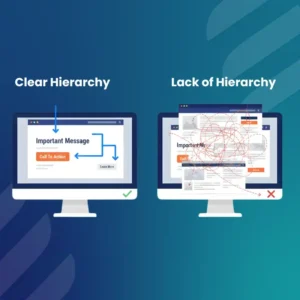
Visual hierarchy means organizing your design so that the most important elements, your headline, your CTA, and your key benefit, get seen first.
Here is how attention flows on a well-designed page:
| Element | Purpose |
| Headline | Grabs attention, states the value |
| Subheading | Adds context and builds interest |
| Hero image or visual | Confirms the message emotionally |
| CTA button | Tells the visitor exactly what to do |
| Social proof | Removes doubt before they scroll |
Sites with clear CTAs convert 42% better than those with vague messaging. SQ Magazine
Design Is More Than Decoration — It’s Communication
Design is not decoration. It is communication, and what you are communicating through your layout is either confidence or confusion.
A great example of this is Basecamp. Their homepage uses a single, direct headline and one CTA. No clutter, no competing messages. Their conversion rate improved significantly after stripping down the visual noise.
If you are working with a website design company or looking at website design ideas, the priority should always be clarity first, style second.
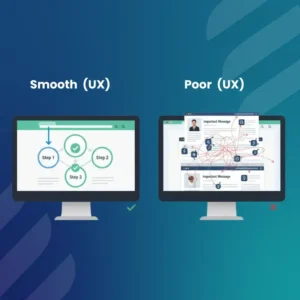
UX/UI Design Services: User Experience and Ease of Use
You can have a beautiful website and still lose customers if it is confusing to use. This is where UX/UI design services become the real difference-maker.
61% of users will leave a website if the navigation is confusing or complex. And once they are gone, they rarely come back. SQ Magazine
Good UX comes down to a few non-negotiables:
- Navigation: Users should find what they need in 3 clicks or less
- Mobile optimization: Mobile devices account for approximately 62.45% of global internet traffic, so a mobile-first approach is not optional. Convergine Corp.
- Forms: Ask for only what you need. Every extra field drops your conversion rate
- Readability: Use font sizes that are easy to read, with enough white space
86% of consumers say they will switch brands if they encounter poor customer experiences twice. Tapflare
Airbnb is a textbook case here. They redesigned their search and booking flow specifically to reduce friction. Fewer steps, clearer pricing, and a smoother mobile experience led to measurable conversion gains.
For product design services and services UI design targeting B2B clients, reducing friction is even more critical. Your buyer is busy. If your site makes them think too hard, they will go to a competitor.
Page Speed and Performance: The Silent Conversion Killer
This is the one most businesses ignore until it is too late.
Around 53% of users will abandon a page if it takes longer than three seconds to load, with mobile users even less patient. Convergine Corp.
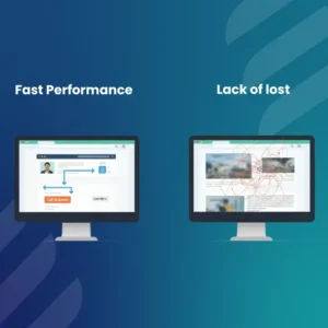
Pages that load in 1 second have 3x higher conversion than pages loading in 5 seconds. A 100ms delay in load speed can even cause a 1% drop in sales. Marketing LTB
That sounds small until you calculate it at scale.
Key speed factors to fix first:
- Compress and convert images to WebP format
- Minimize unnecessary plugins (can reduce load time by 1 to 4 seconds)
- Use a CDN (Content Delivery Network) to reduce global latency
- Enable browser caching
- Optimize your hosting server response time
For a WordPress website design company, speed optimization is especially important because WordPress can get heavy fast with poorly coded themes and excessive plugins.
Website design and SEO are also directly connected here. Google uses Core Web Vitals as a ranking factor. Only 47% of sites currently meet Google’s Core Web Vitals thresholds. That means if you fix your speed, you are already ahead of more than half of your competitors.
Test, Review, and Prepare for Launch
Designing and launching a website is not a one-time event. It is an ongoing process.
Before any launch, run through this checklist:
| Test Area | What to Check |
| Mobile responsiveness | Does it work on all screen sizes? |
| Page speed | Are all pages under 3 seconds? |
| CTA placement | Is there a clear CTA above the fold? |
| Browser compatibility | Does it look right in Chrome, Firefox, and Safari? |
| Form functionality | Do all forms submit and send notifications? |
| 404 errors | Are there any broken links? |
| Analytics setup | Is Google Analytics or an equivalent installed? |
After launch, the real work begins. A/B test your headlines, CTA button colors, and page layouts. User-centric design has been shown to increase conversion rates by up to 220% over time, but only if you keep testing and improving. SQ Magazine
Website development at QM Logics follows a process-driven approach, from initial design through testing and post-launch optimization, to make sure every element of your site is built to convert, not just to impress.
What Makes a Website Actually Convert in 2026
Let’s bring it all together.
A high-converting website in 2026 is:
- Fast (under 2 seconds load time)
- Clear (one message, one CTA per section)
- Mobile-first (not just mobile-friendly)
- Trust-building (social proof, credentials, clean design)
- Easy to navigate (3 clicks to anything important)
Whether you are a website designer building for clients or a business owner evaluating your current site, these are not nice-to-haves. They are conversion requirements.
“Your website is your best salesperson. It works 24/7, never takes a day off, and is usually the first thing a potential client sees. Make sure it performs like one.”
If your current website is not doing that, it is time to rethink the design from the ground up. QM Logics specializes in building websites that are designed for performance, from manufacturing website design and construction website design to full-scale B2B website design solutions. Every project starts with your business goals and ends with a site that actually converts.
Final Thoughts
Designing a website isn’t an expense. It’s an investment that returns to you or slowly sucks the life out of your business.
People make quick decisions, leave quickly, and rarely return after a poor experience. Within the first couple of seconds, you either gain their trust or they lose the sale altogether.
The great thing is that a lot of your rivals are still doing it incorrectly. Lack of a clear call to action, confusing navigation, and slow loading speed. If you can do those things, you’ve already jumped ahead.
Do a realistic assessment of your existing website. See if you have a bounce rate. Do you know what to do if a first-time visitor lands on your page within 3 seconds?
If the answer is no, that’s where QM Logics comes into play. Whether you need a B2B website design, a medical website design, or anything in between, the aim is the same. Build something that performs as hard as your enterprise does.
Frequently Asked Questions
Does website design really affect how many leads I get?
Absolutely. Design is often the first thing that determines whether a visitor stays or leaves. A poorly designed site signals unprofessionalism, and most visitors will not give you a second chance. Studies consistently show that businesses with well-designed, fast, and easy-to-navigate websites generate significantly more leads than those with outdated or cluttered designs. It is not just about aesthetics. It is about whether your site makes it easy for someone to trust you and take action.
How does website design impact the number of leads I am able to get?
Absolutely. First impressions can make or break whether a visitor will stay or go, and design is key to this. If your site is poorly designed, you’re making an impression of unprofessionalism, and most visitors will not return to your site again. Businesses with fast and easy-to-navigate websites have been proven to produce many more leads than those with poorly designed and slow websites. It’s not only a matter of looks. It’s about whether or not it’s easy for someone to trust you and take action.
What is the most important feature of the design for conversions?
If you had to pick one, it would be clarity. In seconds, your visitor should know what you do, who you do it for, and what they should do next. But it is important to remember that a clear headline, a clear CTA, and a clean layout up top will beat any pretty layout that gets people lost every time. Clarity is the second largest mistake that most businesses are making these days, after page speed.
What is the difference between UX design and UI design, and which is more important for conversions?
UI (User Interface) is the appearance of your website, the colors, fonts, buttons, and graphics. It is the feeling of using, UX (User Experience). Both have implications, but UX has a more obvious impact on conversions as it directly determines if your visitor can actually take the action you want them to take. A lovely UI, but a terrible UX, is like a fancy car without a steering wheel. It looks nice, but it won’t go anywhere.
How many times should a business redesign its website?
A good rule of thumb is to redesign the site every 3 – 4 years, but it’s really dependent on the performance data. If your bounce rate is up, your conversion rate is down, or your site is starting to feel stale in comparison to your competition, don’t wait for an upcoming redesign. Your website should be checked at least once a quarter and the data analyzed, user behavior monitored, and industry trends followed.